
When performing technical analysis in crypto markets, most people often start by exploring price charts, drawing trendlines, and trying to spot patterns manually. Such a process is often prone to inaccuracies, time-consuming, tiring and hard to scale. If you want to analyze multiple assets, test strategies, or react to market moves in real time, manual charting quickly hits its limits.
This is where automation comes in. By combining Python with real-time crypto market data from the CoinGecko API, you can transform technical analysis into a systematic, data-driven process..
In this guide, we will build a Python script to fetch historical OHLC (Open, High, Low, Close) price data, create interactive candlestick charts, calculate popular technical indicators, and programmatically detect a classic candlestick pattern. Whether you’re a developer building trading tools or a trader looking to sharpen your edge, this tutorial will give you a solid foundation for automating your crypto technical analysis.
Disclaimer: This guide is for educational purposes only and should not be considered financial advice. Always do your own research.
What Are Candlestick Charts in Crypto Trading?
Candlestick charts are a powerful way to visualize an asset’s price movements over a specific period, making them essential for technical analysis. Each ‘candle’ provides a compact summary of market action, helping traders quickly interpret sentiment, volatility, and potential trend reversals.
Each candlestick is built from OHLC data, which consists of four key price points for a given interval:
-
Open (O): The price at the beginning of the time period
-
High (H): The highest price reached during that period
-
Low (L): The lowest price reached during that period
-
Close (C): The final price at the end of the time period
They are often augmented by Volume (V), which indicates the amount of trading activity during that period, usually shown as a separate bar chart below the candlesticks.
A candlestick has two main features:
-
Body: This is the rectangle between the open and close prices. Its color indicates the direction of movement:
-
Green: Price closed higher than it opened, could indicate bullish price movement.
-
Red: Price closed lower than it opened, could indicate bearish price movement.
-
The size of the body reflects the strength of the move – larger bodies typically mean stronger momentum.
-
Wicks (or Shadows): Thin lines extending above and below the body.
-
The upper wick shows the highest price reached during the selected interval
-
Similarly, the lower wick shows the lowest price reached
-
Wicks are valuable because they reveal volatility and price rejection. For example, a long upper wick may suggest that buyers pushed the price up but sellers quickly forced it back down, signaling potential weakness.
Together, the body and wicks reveal the constant movements between buyers and sellers within a trading period. Patterns formed by multiple candlesticks are the building blocks of more advanced technical analysis, which we will explore programmatically in this guide.
Prerequisites
We will make use of a Jupyter notebook as our primary development environment. Additionally, the following packages need to be installed.
pip install pandas
pip install plotly
Pandas is a popular DataFrame library, which we will use to store and manipulate OHLC data. Plotly is a powerful data visualization library we will use to create interactive candlestick charts.
We will also import several packages throughout this guide. You can add these to the top of your Python script or Jupyter notebook cell:
import pandas as pd
import requests as rq
import json
from datetime import datetime
import plotly.graph_objects as go
from plotly.subplots import make_subplots
To start coding in a new notebook, execute the following command in the terminal:
jupyter lab
This should open up a new tab in a browser. To get a head start, you can clone the complete notebook from the GitHub repository and open it in your Jupyter environment. Remember to replace the placeholder for the API key with your own.
💡 Pro-tip: Do not insert API keys into the notebook directly. It is a bad security practice to hardcode API keys directly into a notebook.
What’s The Best Way to Fetch Crypto OHLC Data?
The best way to fetch crypto OHLC (Open, High, Low, Close) data is by using a comprehensive cryptocurrency data API, such as the CoinGecko API. The following CoinGecko API endpoints deliver structured, historical and real-time OHLC data ready for analysis:
-
/coins/list – Get list of supported coins on CoinGecko with coin ID, name and symbol
-
/coins/{coin_id}/ohlc – Get OHLC data based on a given coin ID
-
/coins/{coin_id}/ohlc/range – Get OHLC data of a given coin within a range of timestamps (exclusive endpoint available only on paid plans)
CoinGecko API key
To access the API endpoints, you will need at least a Demo API key. If you don’t have one, read this guide on how to get your free Demo API key. While most examples in this guide use the free Demo API, some advanced features, and access to exclusive endpoints require a paid API plan.
Setting Up the API Access
In order to have our environment set up for secure API access, we can save the keys locally to a file and read from there whenever needed. The use_demo (or the use_pro for paid API plans) header is used in the get_response function, which will make the request for us. Status code 200 indicates that the request was successful.
💡 Pro-tip: Here’s the full list of response codes and corresponding statuses that can happen when making API calls.
The base URLs for the public Demo API and the Pro API are assigned to the following variables:
PUB_URL = "https://api.coingecko.com/api/v3"
PRO_URL = "https://pro-api.coingecko.com/api/v3"
Using the demo API endpoint /ping, we can now validate if our setup is working as expected.
get_response("/ping", use_demo, "", PUB_URL)

## Output: {'gecko_says': '(V3) To the Moon!'}
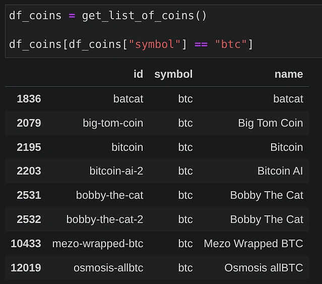
Get list of coin IDs
In order to make use of the OHLC API endpoint, we need to know the coin ID. Here’s the function we can use to fetch the list of coin IDs for a given symbol such as “btc”.
Fetch OHLC data using CoinGecko API
We will make use of the /coins/{coin_id}/ohlc API endpoint to retrieve OHLC data for a given coin ID. Additionally, we can specify the following additional parameters:
-
“vs_currency”: Target currency in which price data will be reported
-
“days”: Time period for historical data (available options are 1, 7, 14, 30, 90, 180, 365, max)
-
“precision”: Number of digits after the decimal for price data
-
“interval”: Controls the data granularity (e.g., ‘daily’, ‘hourly’). This parameter is exclusive to Pro API. On the Demo API, the interval is automatically selected based on the number of days requested.

The function below takes the additional parameters as input arguments. The API response is converted into a Pandas DataFrame with columns for ‘timestamp’, ‘open’, ‘high’, ‘low’, and ‘close’. The timestamp is also converted to a standard DateTime format for better readability and sorted for consistency.
Here are the results for BTC-USD prices in the last 90 days (query run on 2025-09-27 using “auto” interval):
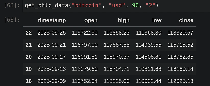
Note that the “auto” selected interval is every 4 days in this case.
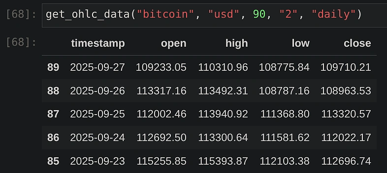
💡 Pro tip: On the Pro API, you can use the `interval` parameter to specify data granularity. For example, you can request ‘daily’ interval data for up to 180 days or ‘hourly’ interval data for up to 90 days, allowing you to conduct more granular analysis.
How to Plot a Candlestick Chart in Python?
You can plot a candlestick chart in Python using libraries like Plotly, which can directly visualize the OHLC data stored in a Pandas DataFrame. The function below uses the data we fetched from the CoinGecko API to generate an interactive chart by dynamically plotting candlesticks for different pairs of currencies.
Additionally, the figure can be customized using the .update_layout() method provided by the plotly.graph_objects.Figure object. The “plotly” template is used as an example, but you can easily switch to others like ‘ggplot2’ or ‘seaborn’ to customize the appearance.
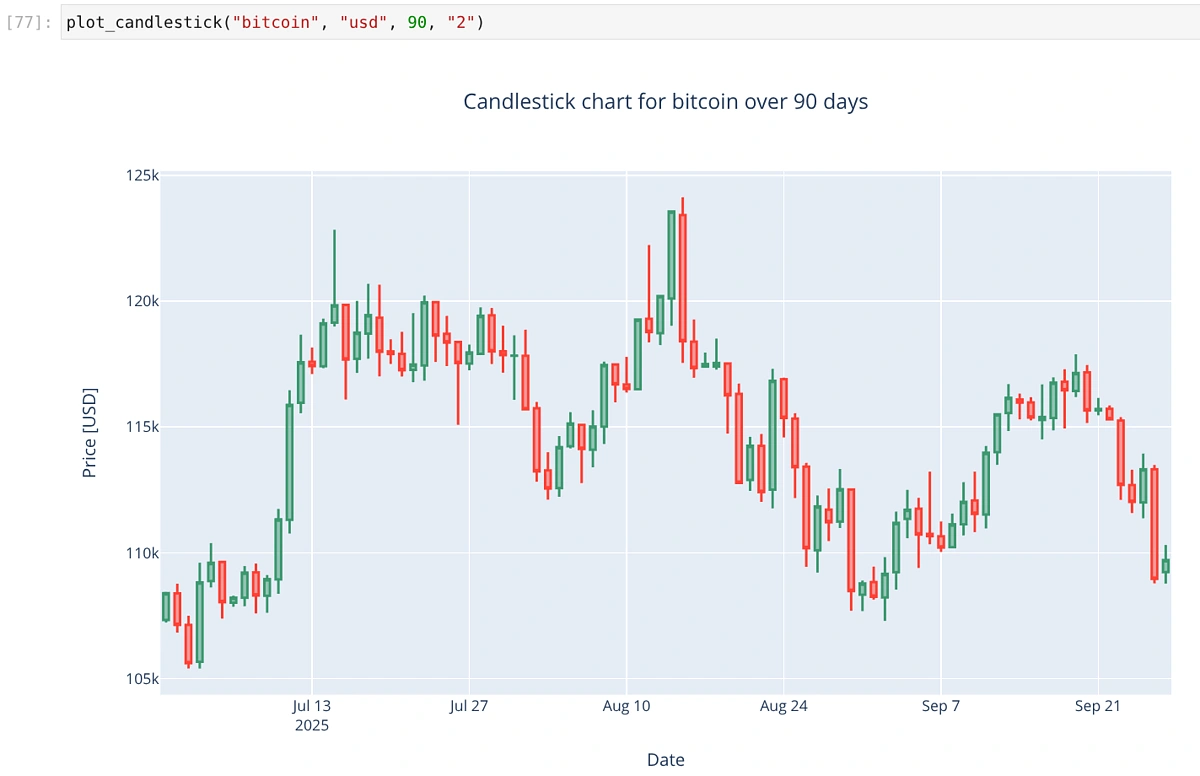
The resulting plot is interactive; you can hover over any candle to see its specific OHLC values. Plotly automatically colors the candles green or red based on whether the closing price was higher or lower than the opening price.
💡 Pro tip: You can zoom into a specific time period by using the range slider within the chart. To get back the original view, hover your mouse in the top right corner and click on the home icon (reset axes).
What Are Some Common Technical Indicators for Crypto Analysis?
Some of the most common technical indicators used in crypto analysis include the Simple Moving Average (SMA), Relative Strength Index (RSI), Bollinger Bands, and the Moving Average Convergence Divergence (MACD). These are essentially mathematical calculations applied to an asset’s price and volume data to help traders better understand market behavior.
Here’s a brief overview of what each of these indicators helps accomplish:
-
Simple Moving Average (SMA): A rolling average of prices over a set number of periods. Helps identify the overall trend direction by smoothing out short-term price distractions.
-
Relative Strength Index (RSI): Measures momentum to determine if an asset is potentially ‘overbought’ and due for a correction, or ‘oversold’ and due for a rebound.
-
Bollinger Bands: These are price envelopes plotted at two standard deviations (std) above (upper band) and below (lower band) the simple moving average of the daily price.It helps gauge market volatility. The bands widen when volatility is high and narrow when it’s low, signaling potential price breakouts.
-
Moving Average Convergence Divergence (MACD): A trend-following momentum indicator that tracks the relationship between two moving averages. It helps spot changes in the strength and direction of a trend by comparing two moving averages.
How to Add Technical Indicators to Crypto Charts?
You can add technical indicators by first calculating them using the OHLC data from the CoinGecko API with the Pandas library, and then plotting the results as new layers on your chart. In the following sections, we will demonstrate how to compute and visualize SMAs, RSI, Bollinger Bands, and MACD.
How to Calculate and Plot Simple Moving Averages (SMA)?
SMA smoothens out the fluctuations in the price data over a given window. The function below adds two new columns to our Pandas DataFrame, which differ only in the length of the window used.
We will now plot the SMAs by creating separate line ‘traces’ and adding them to our existing plotly.graph_objects.Figure.
For the plot example, we are looking at 180-day historical BTC-EUR OHLC data, with SMA windows of 10 (short) and 30 (long) days. Before calculating the SMAs, ensure the DataFrame is sorted by timestamp in ascending order. This is crucial for the rolling calculation to work correctly.
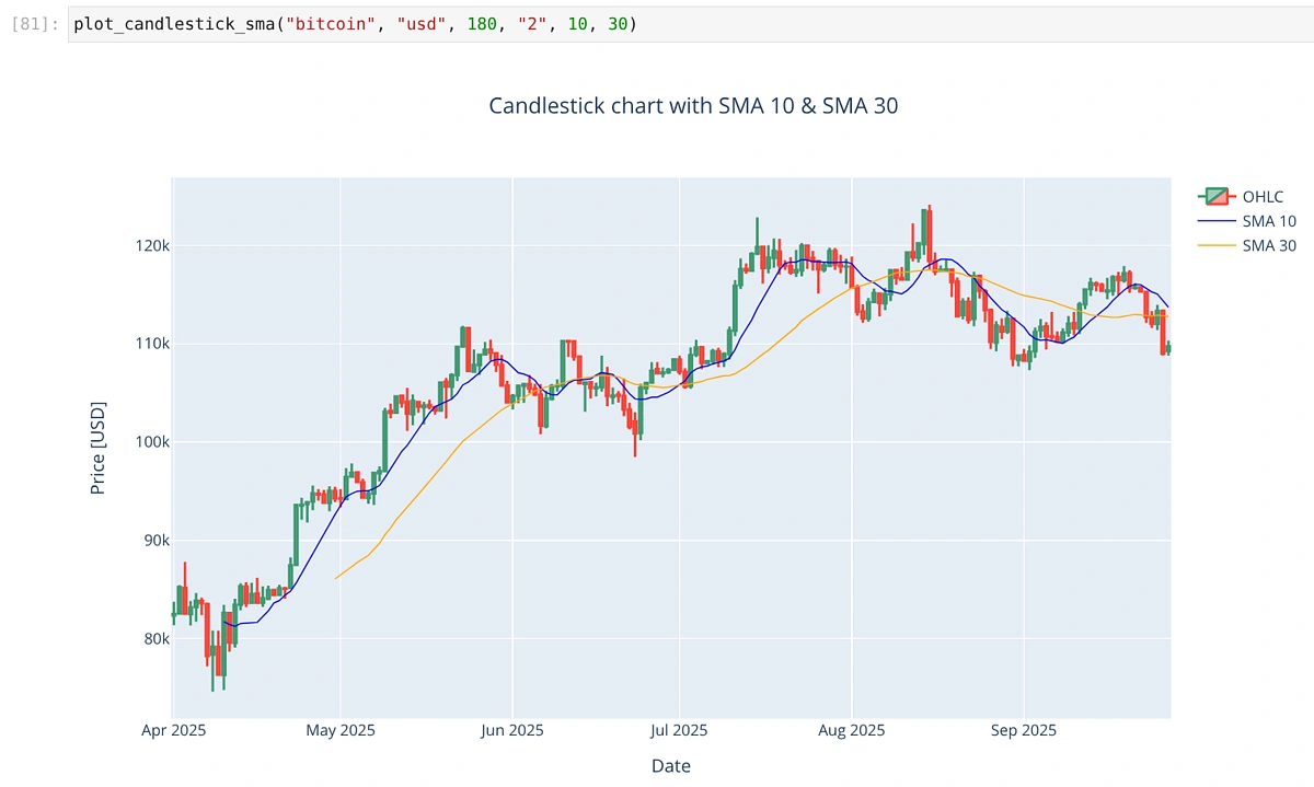
We can identify signals based on how the 10-day and 30-day SMA lines cross one another.
-
Bullish signal (Golden Cross)
When the 10-day SMA (blue) crosses above the 30-day SMA (orange), it indicates that short-term momentum is stronger than the longer-term trend. Traders often read this as a potential start of an upward move.
-
Bearish signal (Death Cross)
When the 10-day SMA crosses below the 30-day SMA, it suggests short-term weakness relative to the long-term trend. This can be interpreted as a potential shift toward bearish momentum.
Do note that these signals should not be used in isolation. They work best when combined with other indicators (like RSI or MACD discussed below) and broader market context.
How to Measure Momentum with the Relative Strength Index (RSI)?
The formula for RSI involves looking at the average gains and losses over a chosen period (commonly 14 days):
RSI = 100 - (100 / (1 + RS))
where RS = Average Gain / Average Loss
RSI is commonly interpreted in the following manner:
-
Overbought ( > 70 ):
Suggests the asset has been rising quickly and may be overextended. Traders often see this as a warning that bullish momentum could be fading, and a pullback or consolidation might follow. -
Oversold ( < 30 ):
Suggests the asset has been falling rapidly and may be undervalued in the short term. This can signal weakening bearish momentum and the possibility of a rebound. -
Neutral ( 30–70 ):
Indicates balanced conditions. Within this range, RSI can also show subtle shifts in momentum. For example:- Rising from 40 to 60 suggests strengthening bullish momentum
- Dropping from 60 to 40 suggests momentum is fading
In the function below, we calculate the RSI based on the above formula and add a new column to our Pandas DataFrame.
We can now plot the RSI as a subplot along with the candlestick chart. To display the RSI indicator cleanly, we use make_subplots(rows = 2, cols = 1 …) to create a figure with two vertically stacked charts. We then add the candlestick trace to the first row (row=1, col=1) and the RSI trace to the second row (row=2, col=1).
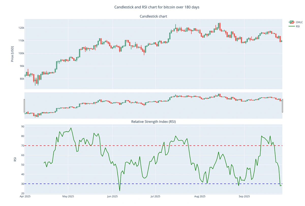
Using the interactive range slider, we can also easily zoom into a desired date range if needed.
How to Visualize Volatility with Bollinger Bands?
You can visualize volatility by calculating and plotting Bollinger Bands. This involves calculating a simple moving average (the middle band) and then adding and subtracting two standard deviations to create the upper and lower bands. The following function adds new band columns based on a default window of 14 days:
The band lines can then be plotted on top of the original candlestick data.
Below is the resulting chart for BTC-USD over 180 days. The middle band is the SMA, displayed as a dotted line for clarity.
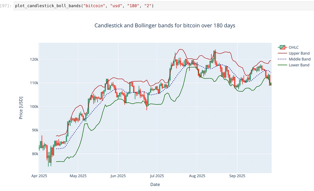
Prices often bounce between the two bands, which could be used to identify potential price targets. For example, when a price bounces off of the lower band, and crosses the simple moving average, the upper band might be considered as the next profit target. Prices can also cross the bands during strong trends. The expansion or contraction of the bands provides insights into price volatility. For example, a large contraction is clearly visible during the end of July 2025 and the start of August 2025. A close look at the candlesticks also confirms that price remained quite steady during this period.
How to Identify Trend Changes with MACD?
You can identify potential trend changes with the Moving Average Convergence Divergence (MACD) indicator. This is done by calculating the MACD line (difference between the 12-period and 26-period EMAs), a signal line (9-period EMA of the MACD), and a histogram (the difference between the two lines).
We will now combine the candlestick, RSI and MACD into one chart with subplots. It is important to remember that distance between the MACD and the signal line is shown via bars in the same plot, with green bars (bullish momentum) indicating the region where MACD > signal, and red bars (bearish momentum) for the opposite. This is achieved by the following logic:
hist_colors = ['green' if val >= 0 else 'red' for val in df_ohlc['macd_histogram']]
The rest of the plotting logic is an extension of what we have already shown before.
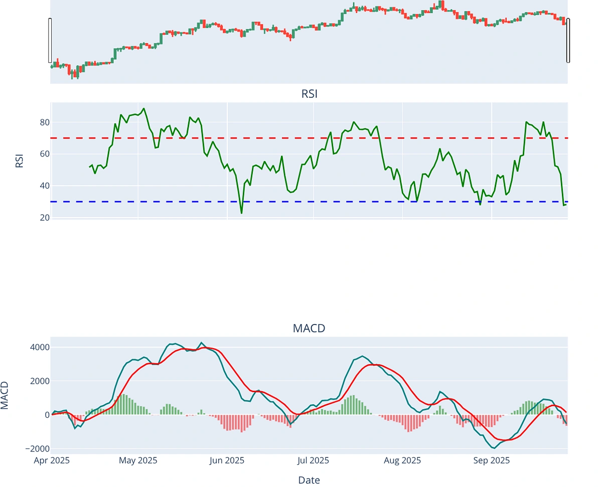
Based on the combined figure above, we can infer the following:
-
Crossovers (MACD Line vs. Signal Line)
-
Bullish Crossover: When the blue MACD line crosses above the red Signal line, it signals increasing bullish momentum. An example is clearly visible during April–May 2025.
-
Bearish Crossover: When the blue line drops below the red, it indicates fading momentum or the start of a downtrend. This is visible during June 2025 and is consistent with a falling RSI as well.
-
-
Histogram
-
The histogram expands as momentum strengthens and contracts as momentum weakens
-
Tall green bars: Strong bullish push (seen around May and July 2025)
-
Tall red bars: Strong bearish push (seen in June, August and September 2025)
-
When the histogram shifts from positive to negative, it usually confirms the crossover signal.
-
-
Zero Line Crossovers
- When the MACD line crosses above the zero line, it signals a potential bullish trend. Conversely, when it crosses below, it suggests a bearish trend.
- Example: Around late April 2025, the MACD moved above zero, confirming the bullish run. By late June, it dropped back below zero, signaling bearish momentum.
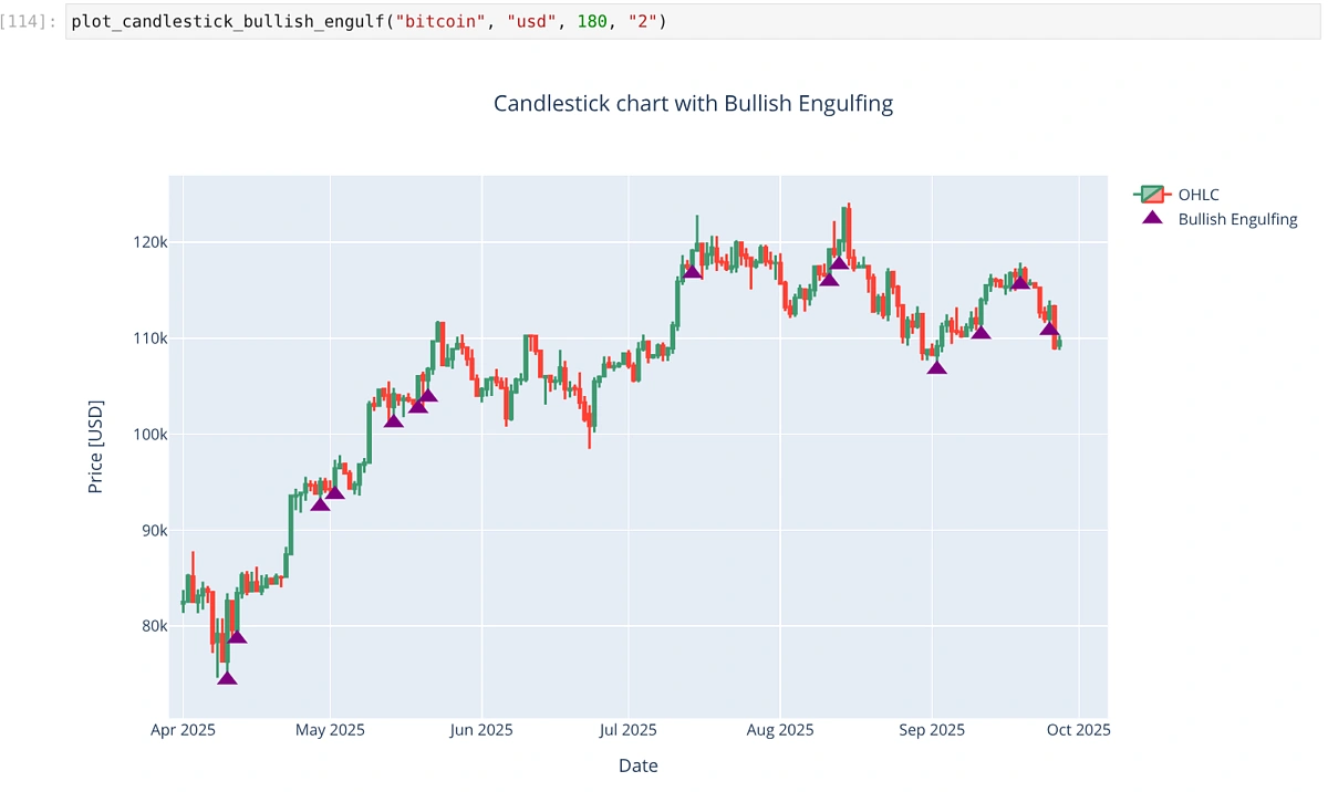
How to Programmatically Detect a Candlestick Pattern?
You can programmatically detect a candlestick pattern by applying conditional logic to the OHLC data within a Pandas DataFrame. By checking the relationships between the open, high, low, and close values of consecutive candles, you can screen for specific formations.
One of the more commonly known reversal signals is called “Bullish Engulfing”. Traders often use it to identify potential turning points where bearish sentiment may be giving way to bullish momentum.
The pattern is formed by two consecutive candles.
-
First Candle: A small bearish (red) candle, indicating sellers were in control during that session.
-
Second Candle: A larger bullish (green) candle that completely engulfs the body of the previous candle (its open is lower and/or close is higher).
The shift from a weak bearish candle to a strong bullish candle shows a sudden surge in buying pressure. This is especially significant when it occurs after a downtrend or during a pullback in an uptrend. It suggests that buyers are stepping in, potentially reversing the prior down move.
Based on what we have learnt, let’s create the logic to filter out days on which the Bullish Engulfing pattern has appeared.
We will create a plot with the candlestick data and overlay it with purple markers that indicate the days on which Bullish Engulfing has appeared. Remember to create a filtered DataFrame out of the whole OHLC data as shown below:
engulfing_df = df_ohlc[df_ohlc['bullish_engulfing']]
The markers are placed just below the low of the candlestick on the relevant day.
The result is a chart that highlights all detected Bullish Engulfing patterns with a purple triangle:
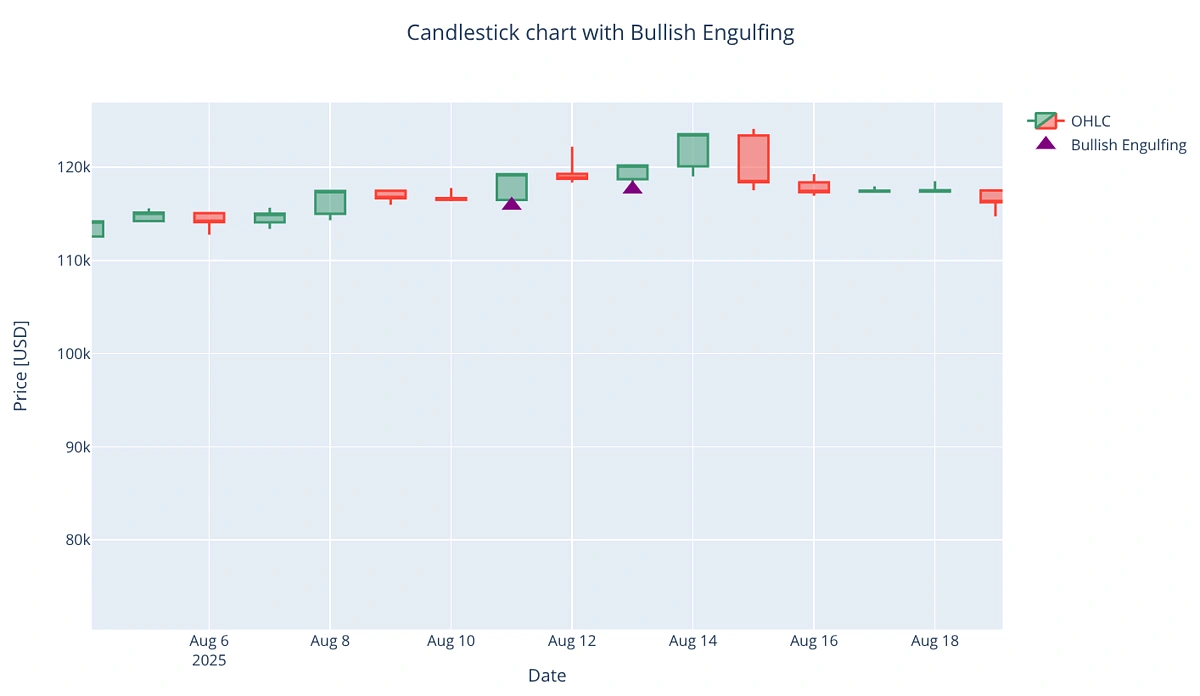
Zooming into the date range of August 2025, we can also validate if the pattern conditions have been correctly satisfied. The green candle completely covers the previous day’s red candle, which is what we expect for Bullish Engulfing.
Conclusion
In this tutorial, we have successfully created a practical toolkit for crypto market analysis. Starting from fetching historical OHLC data through the CoinGecko API, we learned how to visualize price action with candlestick charts, overlay technical indicators like SMA, RSI, Bollinger Bands, MACD, and even detect candlestick patterns programmatically. Together, these elements form the foundation of a crypto technical analysis pipeline.
Automated tools remove much of the emotional bias and subjectivity that might come with manual charting. By programmatically analyzing market data, we can build more robust trading strategies, backtest them at scale, and react to market signals in real time. If you would like to try this out for yourself, the complete source code is available at this GitHub repository.
Finally, if you require more data for advanced analysis, consider subscribing to a paid API plan. A paid plan gives you access to higher rate limits, greater historical data, more granular intervals, and exclusive endpoints ideal for serious quantitative research or algorithmic trading development.